Content Strategy at the MTA
The recruiter was vague when we first talked. The project sounded interesting but I was happy where I was, and didn’t hear anything compelling enough to consider a move. That all changed on the next call when she revealed I’d be doing content strategy at the MTA. They’d just launched a beta site and companion app. They loved my background and wanted me to join their onsite team to keep things moving.
The thought of doing content strategy at the MTA blew my mind. I’d only been freelancing a short time and here was one of the New-Yorkiest of places asking me to join a project that could, in fact, help millions of people. It felt like a great personal and professional match. I find NYC’s subway fascinating. I’m a tax-paying New Yorker who takes the subway everyday. I was well familiar with how janky the subway and its site were. At the time the subway system was under a state of emergency. The site looked like it hadn’t been touched since 1998. While I couldn’t make the trains run on time, I had tons of ideas about how I could help improve the digital experience.
Answering The Content Strategy Call of Duty
My imagination ran wild. The job sounded fascinating, but I had reservations. Would this government-funded organization be more insane than corporate America? Could I stand the bureaucracy? Would I get anything done? I talked to a good friend who’d also freelanced at the MTA. She confirmed the bureaucracy was all it was cracked up to be, and then some. But the pros outweighed the cons for her and I figured they would for me, too. I also clung to the hope that since they actually launched something, the team I was joining had internal support from—someone.
A video call and in-person interview later I said yes, and in August started my gig as the lead content strategist at the MTA.
First Impressions
The agency team I joined was really fun and a little burnt out. The project had entered the dreaded post-launch phase; the place where you start fixing the billions of problems that surface the second people start using it. When I was introduced to the wider team one of the project sponsors told me I was like the guitarist in “Spinal Tap”—the latest in a string of content strategists—and he asked me how long I’d last.
You may think that remark was mean, but it wasn’t. Or at least I didn’t take it that way. If you live in New York you have to get used to abuse. Not the violent kind but the Seinfeldian, Sex-in-the-City-opening-credits-get-splashed-by-a-passing-bus kind, where lousy things happen to you for seemingly no reason. Your Darwinian response to these times will determine how well you do here. Keep charging and you’ll be OK. Flinch? NYC is probably not the place for you. I took the sponsor’s dig as a sign that they knew the project needed some content strategy love, and wanted me to stick around. These were all pluses in my book.
While the headquarters wasn’t bleak, it definitely wasn’t fancy. Take heart New Yorkers, not one dime of your hard-earned tax paying dollars is going to wasteful, frivolous office amenities at the MTA. The kitchen had an ancient, scary microwave, a regular refrigerator from no place special, and a water machine. Lonely packs of sugar and soy sauce mixed together in the back of the drawer that only new hires opened. I put my lunch in the refrigerator, joined my co-workers in an airless, windowless conference room, and got to work.

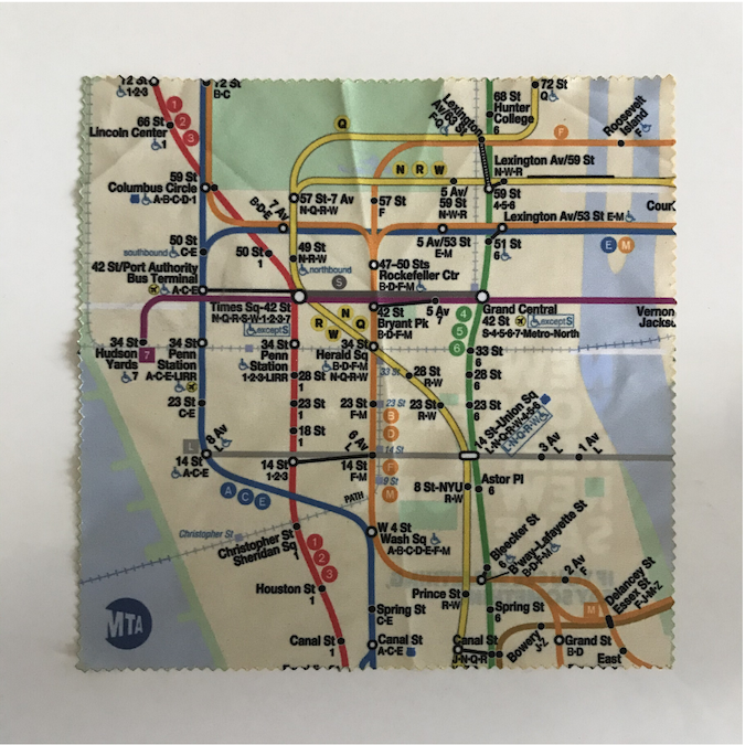
My MTA SWAG: A Screen Cleaning Cloth. I still have it.
Resetting Expectations
Before I started I had big dreams for the project and sketched out what I’d do. First up? A content audit to see exactly what was on the beta site. They’d launched in a hurry and migrated a bunch of pages without much thought to how they’d work in the new experience. I wanted to get a sense of the different rhythms and publishing requirements each department had. Once I had that down I wanted to create a taxonomy that would organize the site’s content and bring it to life.
Spoiler alert: The project was rough from the start. Things more or less stayed that way until the MTA ran out of funding and let us go before the year was out. This is the project I will cite in future interviews when asked, “Tell me about a project where you didn’t succeed.”
Right after I started I realized we all had to focus our collective energy on the technical fixes that needed to happen. I spent my time putting out fires and identifying content fixes the Latin American content authoring team could make that didn’t require a code change. I did find time to audit the site and managed to scratch out a taxonomy. But with extremely limited UX and design help, I couldn’t make any underlying content changes that would have improved the site.
While this wasn’t how I envisioned doing content strategy at the MTA, there were some bright spots. The MTA was embracing all kinds of digital initiatives and our project had advocates who wanted the site to succeed. One of my MTA colleagues was also from Massachusetts and he was a big supporter of the content strategy plans I had in place. We ended up having weekly meetings with other colleagues that helped us make progress on the non-technical content work that needed to happen.
Tiny, Noble Content Strategy Goals
The biggest bright spot? Hiring a bi-lingual business analyst. He translated the crazy site enhancements into tickets and tasks the LatAm content authoring team could work on. Our new colleague was razor sharp and hilarious. Right after he started things clicked and instantly got better.
From that point on we all worked toward a tiny, noble content strategy goal: to make whatever enhancements we could to the CMS. The site launched with only a rich text editor, which made it a cumbersome nightmare to publish relatively simple pages. We knew we could improve the authoring experience for the MTA employees. Sprint by sprint we planned what fixes we could make, and made them.
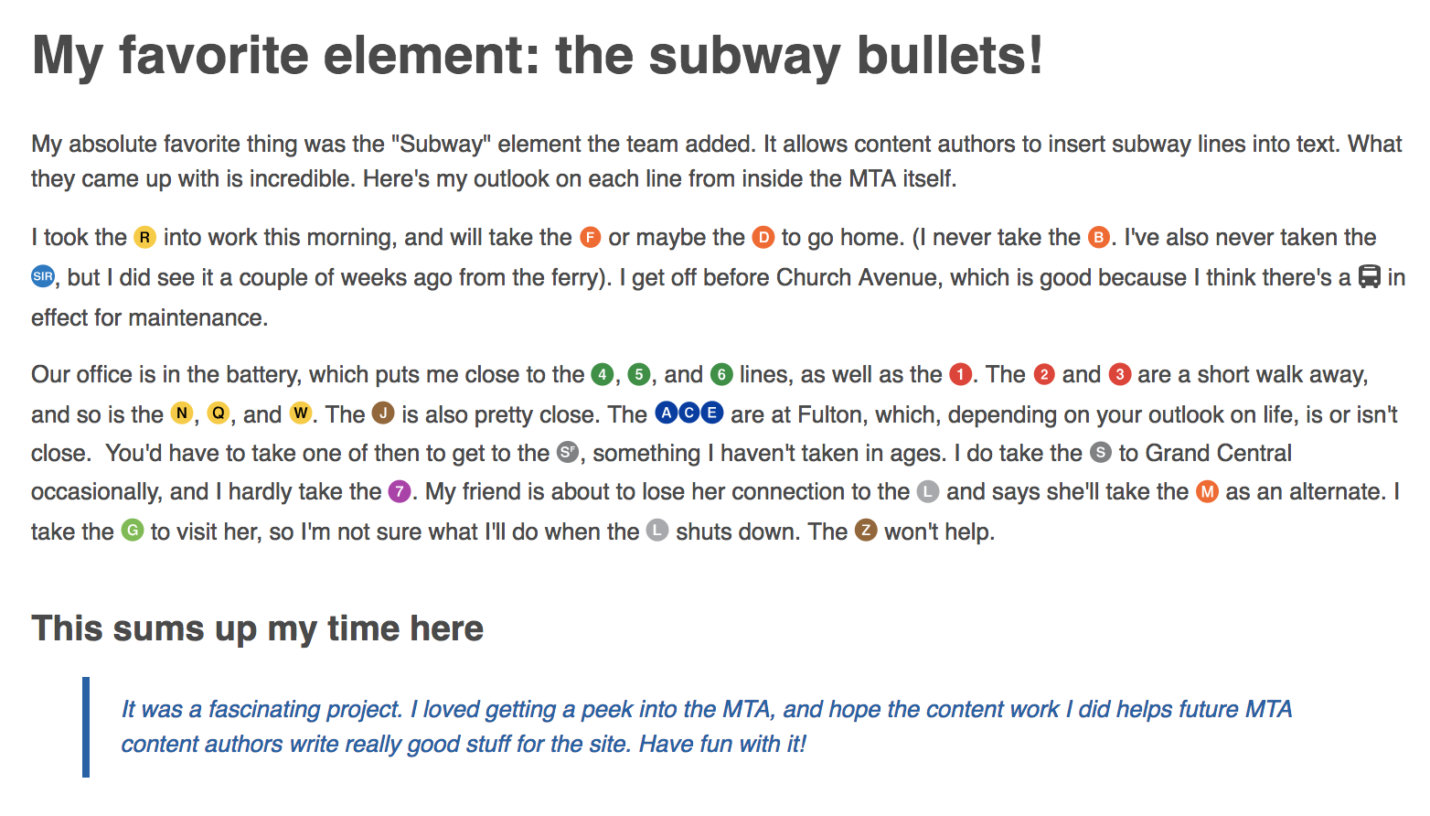
We released a lot of enhancements in a short amount of time. My all-time favorite was the “subway icon/emoji” user story. The MTA publishes articles that embed the different-colored subway icons into the copy. These icons need to appear seamlessly within the published content, which is tricky. The icons also require alt text so screen readers can relay the information to people with accessibility issues.

The subway emoji in action.
Technical concepts are hard to grasp in any language and though the dev team’s English was great my Spanish is rudimentary at best. Explaining this enhancement was tricky until someone (not me) said, “We want the subway icons to appear like emoji in a text message.” Once the team heard that they knew exactly what to do, and we had the enhancement in no time.
Warriors, Come Out and Play
The dev team was a riot and I loved working with them. I felt bad they all hadn’t been to New York to experience the subway first-hand, so I did the only thing I could. One day after sprint planning I chatted up the team and told them them they all had to watch one of my favorite movies, “The Warriors.” In no time one of my colleagues found the trailer in Spanish. He posted the link to the chat room with the caption, “Oh yeah, this looks baaaaaaad :).” My work was done.